
Distributions in Statistics
A theoretical distribution describes how the values of a random variable are distributed or arranged. Understanding distributions is crucial because they provide insights into the characteristics of datasets and help us make predictions about future observations. There are different types of distributions, each with unique characteristics and applications. In this article, I explain some of the most important distributions and provide practical examples to deepen your understanding.
Types of distributions
First things first: Here, we are dealing with theoretical distributions. These need to be distinguished from empirical distributions, which are based on actually observed data. The shapes may of course be similar, but empirical data generally does not follow the course of the theoretical distribution quite as “neatly”.
https://www.youtube.com/watch?v=OezBjGTT6GQ
Normal distribution
The normal distribution, often referred to as the “bell curve”, is symmetrical around its mean.
Characteristics:
- Unimodal
- The mean (average) is equal to the median (central value) and the mode (most frequent value).
- Approximately 68% of the data lie within one standard deviation of the mean.
Example: Adult men’s height generally follows a normal distribution. This means that most men have a height close to the average, while extremely tall or short men are less common.
In R, you can generate and display a normal distribution with the following code:
# Normal distribution
set.seed(123)
data_norm <- rnorm(1000, mean = 170, sd = 10)

# Plot historgram
hist(data_norm, breaks = 30, probability = TRUE, main = "Normal distribution (Height)", xlab = "Height in cm", col = "#47abb2")

# Add density curve
lines(density(data_norm), col = "#03083b", lwd = 2)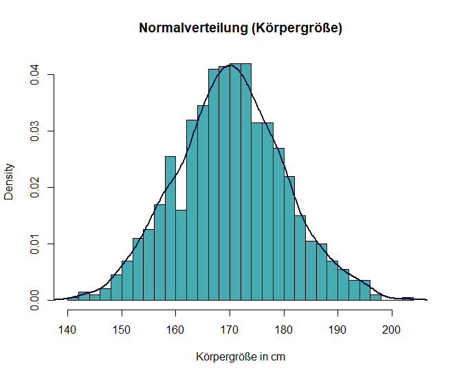
Binomial distribution
The binomial distribution describes the number of successes in a fixed number of trials in which there are two possible outcomes (success/failure).
Characteristics:
- It is defined by the parameters n (number of trials) and p (probability of success).
Example: Imagine that you toss a coin 10 times and count how often heads appears. The number of heads in these 10 tosses follows a binomial distribution. If you toss the coin often enough, you can observe that the result increasingly approaches the expected average of five heads.
In R, you can generate and display a binomial distribution with the following code:
# Binomial distribution
set.seed(123)
data_binom <- rbinom(1000, size = 10, prob = 0.5)

# Plot histogram
hist(data_binom, breaks = 10, probability = TRUE, main = "Binomial distribution (10 coin tosses)", xlab = "Number of heads", col = "#47abb2")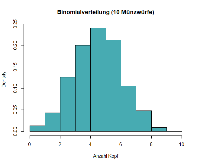
Poisson distribution
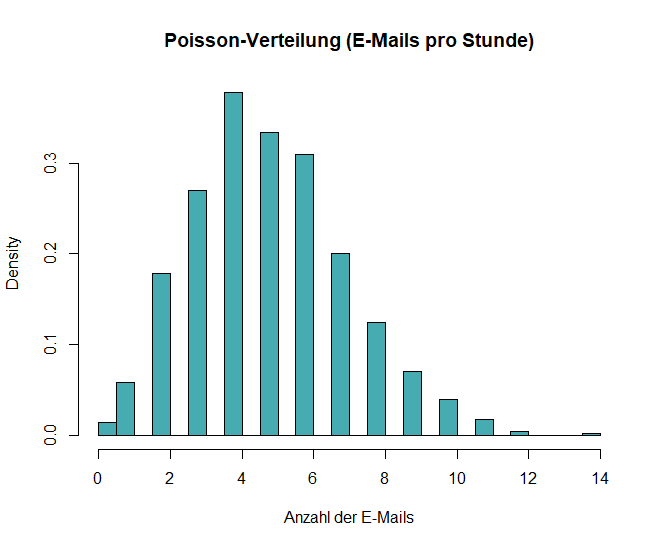
The Poisson distribution models the number of events that occur within a fixed interval when these events happen independently of one another.
Characteristics:
- It is defined by λ (lambda), which represents the average rate at which events occur.
Example: Imagine that you work in an office and want to know how many emails you receive on average per hour. This number can be described by a Poisson distribution because the emails arrive independently of one another and there is an average arrival rate.
In R, you can generate and display a Poisson distribution with the following code:
# Poisson distribution
set.seed(123)
data_pois <- rpois(1000, lambda = 5)

# Plot histogram
hist(data_pois, breaks = 30, probability = TRUE, main = "Poisson distribution (E-Mails per Hour)", xlab = "Number of E-Mails",col = "#47abb2")
Uniform distribution
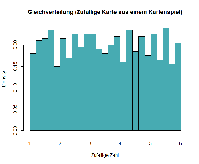
In a uniform distribution, also known as an equal distribution, all outcomes within a given range are equally likely.
Characteristics:
- It can be discrete or continuous. For example, rolling a fair die results in a uniform distribution over the numbers 1 to 6, since each number has the same probability of being rolled.
Example: If you draw a card from a well-shuffled deck, every card has the same probability of being selected. This is a typical example of a discrete uniform distribution.
In R, you can generate and display a uniform distribution with the following code:
# Uniform distribution
set.seed(123)
data_unif <- runif(1000, min = 1, max = 6)

# Plot histogram
hist(data_unif, breaks = 30, probability = TRUE,
     main = "Uniform distribution (Random card from a deck of cards)", xlab = "Random number", col = "#47abb2")
Exponential distribution
The exponential distribution describes the time until an event occurs, such as the waiting time between independent events that occur at a constant average rate.
Characteristics:
- This distribution has the property of “memorylessness”—previous events have no influence on the future probability.
Example: Imagine you are waiting at a bus stop, and buses arrive every 15 minutes on average. The time between bus arrivals follows an exponential distribution, which means that the waiting time after one bus has arrived is independent of how long you have already been waiting.
In R, you can generate and display an exponential distribution with the following code:
# Exponential distribution
set.seed(123)
data_exp <- rexp(1000, rate = 1/15)

# Plot histogram
hist(data_exp, breaks = 30, probability = TRUE, main = "Exponential distribution (Waiting time for Bus)", xlab = "Waiting time in minutes", col = "#47abb2")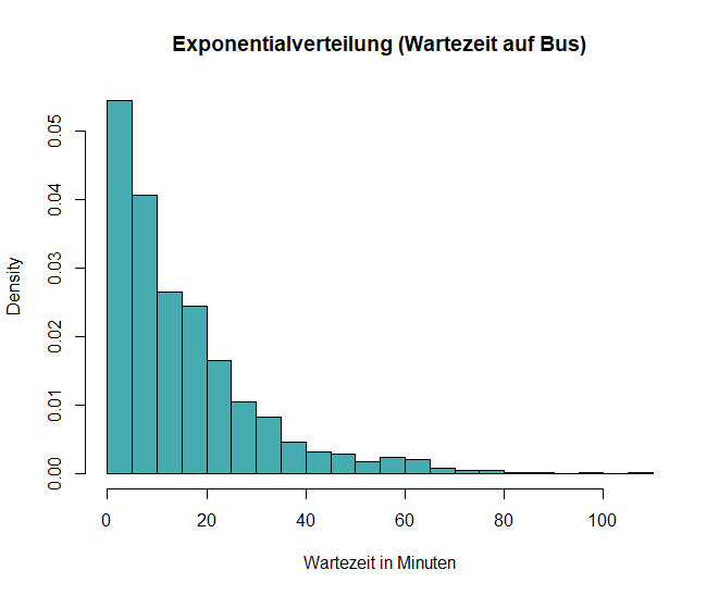
Why is it important to understand distributions?
Data analysis:
If you know which distribution fits your data, you can select suitable statistical methods for analyzing and interpreting it. For example, many analytical methods, such as the t-test and analysis of variance (ANOVA), are based on the assumption that the data follow a normal distribution.
Hypothesis tests:
Many statistical tests assume certain distributions. If you understand these assumptions, you can ensure that the conclusions you draw from statistical tests are valid.
Predictive models:
In fields such as finance or healthcare, understanding how data behave enables analysts to predict trends more accurately. For example, if you know that the number of patients in a hospital follows a Poisson distribution, you can better plan how many doctors are needed during peak periods.
Simulation
I have also recreated the most important distributions in Google Sheets here. There, you can not only see the formulas, but also clearly see which parameters influence the function (and thus produce the corresponding curve).
Here is a practical online tool for experimenting with different population and sample parameters and deepening your understanding of the content covered in this lesson:
Practical examples from everyday life
- If you analyze test results from students in different classes, you might find that they follow a normal distribution. As a teacher, this helps you better understand students’ performance levels and implement appropriate support measures.
- In the quality control of a manufacturing company, the binomial distribution could be used to determine how many defective products are expected based on a sample from a large production batch. This enables managers to maintain quality standards efficiently.
- A hospital could use the Poisson distribution to predict the number of patient arrivals during peak hours. This information helps with staffing decisions and ensures that service remains optimal without overburdening the staff.
Understanding distributions gives you the tools to interpret complex datasets and identify the underlying patterns that support your decisions in various areas!