
Visualization in Statistics
Data visualization is a central part of statistical analysis. It helps present complex relationships in a straightforward way and identify patterns or unusual features in the data. Especially in the age of data science, the ability to visualize data effectively is a valuable skill. In this article, we explore some of the most important techniques for visualizing statistical data and show how to implement them in R.
Why is visualization important?
Visualizations provide quick access to data by enabling us to immediately identify trends, distributions, or outliers. This makes it possible to formulate or test hypotheses before conducting more in-depth statistical analyses.
Principles of data visualization
Many researchers have not received sufficient training in design principles to communicate their messages visually in the best possible way. Effective figures are not merely a by-product of academic work; they are crucial for communicating its key messages.
Good visualizations require planning, deliberate decisions, and a basic understanding of design principles. The article The Bigger Picture (Midway, Stephen R., Patterns, Volume 1, Issue 9) presents principles that can help make scientific visualizations more effective and clearer.

Principle 1: Plan before designing
The first and perhaps most important step is to clarify the central message of the visualization before beginning to create it. The question is: What is the figure intended to achieve? Should it show a comparison, illustrate a relationship, or display the distribution of data? Only once this message is clear should the visualization be designed—ideally starting with pen and paper so as not to be influenced by the limitations of software.
Principle 2: Choose the right software and geometries
Effective visualizations require the use of suitable software. A simple spreadsheet program is often not enough to create complex and appealing visuals. Scientists must be willing to learn new tools or expand their existing skills. At the same time, it is crucial to choose the right geometric representation—whether a scatterplot, histogram, or boxplot. Each geometry has its strengths and weaknesses, and the choice should be based on the message of the visualization.
Principle 3: Use colors strategically
Colors are a powerful tool in visualization, but they must be used carefully. Colors convey information, whether directly or subtly, and influence how data are perceived. It is important to ensure that figures remain understandable in grayscale and are accessible to readers with color vision deficiencies. Tools such as ColorBrewer can help in selecting suitable color schemes.
Principle 4: Make uncertainty visible
A common error in scientific visualizations is the lack of uncertainty information. Whether represented through confidence intervals, error bars, or other means, uncertainties should be communicated clearly to avoid misunderstandings. Scientific visualizations rely on presenting both the data and its limitations transparently.
Principle 5: Balancing Simplicity and Detail
A successful figure is often simple in design but rich in detail in its description. The accompanying captions should be comprehensive enough for the figure to be understood even without the rest of the text. At the same time, unnecessary design elements, often referred to as “chartjunk,” should be avoided so that the core message is not diluted.
Principle 6: Feedback and Continuous Improvement
No one sees a figure’s weaknesses as clearly as an outside observer. It is therefore advisable to seek feedback from colleagues—ideally on the figure alone, without the accompanying text. This ensures that the visualization works independently and is clear and easy to understand.
Illustrative Forms of Presentation
Column Charts and Bar Charts
Column or bar charts are excellent for presenting categorical data. They make it easy to compare the frequency or proportion of different categories. A column chart displays the categories on the x-axis and the frequencies on the y-axis.
Example: Column Chart in R
# Example: Bar chart
library(ggplot2)

# Dataset: Number of rooms and frequency
rooms <- data.frame(
  Category = c("1 room", "2 rooms", "3 rooms", "4 rooms"),
  Frequency = c(50, 120, 200, 80)
)

# Create plot
ggplot(rooms, aes(x = Category, y = Frequency)) +
  geom_bar(stat = "identity", fill = "lightblue") +
  ggtitle("Number of apartments by number of rooms") +
  theme_minimal()
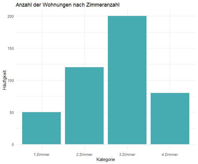
This example shows the number of apartments with different numbers of rooms in a bar chart. This is a simple but effective way to visualize categorical data.
Histograms
For continuous data, the histogram is suitable. It shows how values are distributed across different intervals. The book emphasizes the importance of histograms for representing distributions in a simple way.
Example: Histogram in R
# Example: Histogram
set.seed(123)  # For reproducibility
data <- rnorm(1000, mean = 50, sd = 10)  # Example normal distribution

# Create plot
ggplot(data.frame(data), aes(x = data)) +
  geom_histogram(binwidth = 2, color = "black", fill = "lightblue") +
  ggtitle("Histogram of the distribution") +
  theme_minimal()
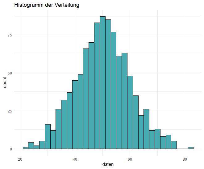
Here we have a normally distributed random variable whose distribution is visualized with a histogram. The distribution can be understood immediately and checked for normality.
Boxplots
A boxplot is another useful tool for displaying distributions, especially when you want to compare several groups with one another. A boxplot shows the range, the median, and possible outliers in the data.
Example: Boxplot in R
# Example: Boxplot
daten_zimmer <- data.frame(
  Zimmer = factor(rep(c("1 Zimmer", "2 Zimmer", "3 Zimmer", "4 Zimmer"), each = 100)),
  Miete = c(rnorm(100, mean = 500, sd = 50),
            rnorm(100, mean = 700, sd = 70),
            rnorm(100, mean = 900, sd = 80),
            rnorm(100, mean = 1200, sd = 100))
)

# Create boxplot
ggplot(daten_zimmer, aes(x = Zimmer, y = Miete)) +
  geom_boxplot(fill = "#47abb2") +
  ggtitle("Net rent by number of rooms") +
  theme_minimal()
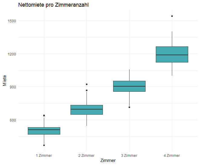
This boxplot compares the distribution of net rent depending on the number of rooms. Boxplots are useful for identifying differences in the distributions of individual groups.
Scatterplots
The scatterplot is ideal for illustrating the relationship between two metric variables. On pages 42 to 43 of the book, the scatterplot is highlighted as an indispensable tool for exploring relationships.
Example: Scatterplot in R
# Example: Scatterplot
daten_fläche_miete <- data.frame(
  Wohnfläche = rnorm(100, mean = 70, sd = 15),
  Nettomiete = rnorm(100, mean = 900, sd = 200)
)

# Create scatterplot
ggplot(daten_fläche_miete, aes(x = Wohnfläche, y = Nettomiete)) +
  geom_point(color = "blue") +
  ggtitle("Relationship between living area and net rent") +
  theme_minimal()
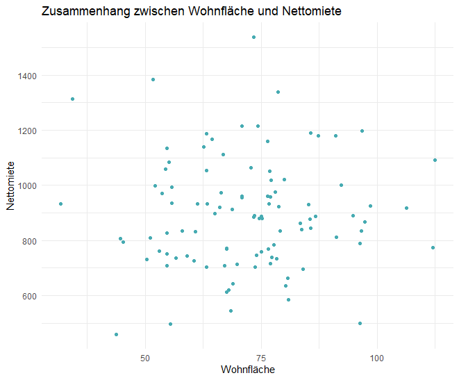
The scatterplot shows the relationship between living area and net rent. This is particularly useful for checking whether a linear relationship exists or whether other patterns can be identified in the data.
Visual storytelling
This exemplary list of possible ways of presenting information is actually very short and, in some respects, inadequate. Given the ubiquity of data in everyday life, it is becoming increasingly important to connect visual representations and other considerations (such as the underlying story) more closely.
For example, Zhang et al. (2022, A visual data storytelling framework. Informatics, 9(4), 73. https://doi.org/10.3390/informatics9040073) develop an innovative framework in their paper that combines visual data storytelling with narrative and entertaining elements. The aim is to present data not only informatively, but also accessibly and engagingly. Using a modular approach based on information structuring, technological integration, and cognitive factors, traditional data visualization is expanded through interactive and story-based formats. The authors demonstrate this with a prototype that illustrates how narrative units can be integrated into interactive data presentations. This approach offers new opportunities for making complex data understandable to a broad audience and translating it into actionable insights.
Conclusion
Visualization is an indispensable part of data analysis. It helps us identify patterns in data, formulate hypotheses, and communicate results. The methods presented in this article are just a small selection of the many possibilities R offers for visualizing data. The visualization techniques described on pages 37 to 45 of the book provide an excellent introduction, and you can easily apply the examples shown here to your own datasets.