
Bivariate correlation: An introduction to the Pearson correlation coefficient
The Pearson correlation coefficient, named after Karl Pearson, is a statistical measure that quantifies the linear relationship between two metric variables. Here, we will take a closer look at how to calculate and interpret it.
Definition and Interpretation of the Pearson Coefficient
The formula for the Pearson correlation coefficient is:

Interpretation of the Correlation Coefficient
The value of r ranges between -1 and +1:
- +1: Perfect positive correlation (when one variable increases, the other increases proportionally).
- 0: No linear correlation (no linear relationship between the variables).
- -1: Perfect negative correlation (when one variable increases, the other decreases proportionally).
The strength of the relationship is often interpreted as follows:
| Correlation coefficient (r) | Strength of relationship |
|---|---|
| 0.0 to 0.2 | Very weak |
| 0.2 to 0.4 | Weak |
| 0.4 to 0.6 | Moderate |
| 0.6 to 0.8 | Strong |
| 0.8 to 1.0 | Very strong |
Sometimes, it is necessary to transform variables before carrying out the actual hypothesis test. This is not a problem—the result of the correlation will not change (apart from possibly the sign), as long as the transformation is linear. This is also referred to as the scale independence of r.
Visualizing relationships
Scatterplots are useful for gaining a better understanding of the relationship between two variables. An example of a strongly positive scatterplot shows how the points lie close to an upward-sloping line.
Conditions for application
To apply the Pearson correlation coefficient meaningfully, the following conditions should be met:
Metric levels of measurement: Both variables must be measured at the metric level. You either know this based on how the data are defined or because they empirically “look that way” (e.g., decimal places, many different values, etc.). If one of the variables is only measured at the ordinal level, you should switch to a rank correlation .
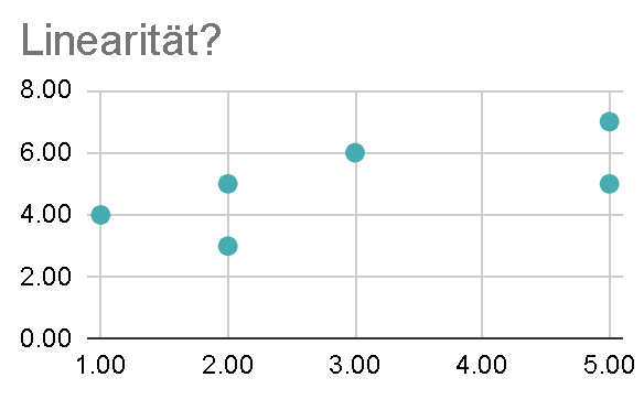
Linear relationship: The relationship should be approximately linear. You can check this by looking at a scatterplot. Can you imagine a straight line that summarizes the point cloud reasonably well? What we definitely do not want to see is a (inverted) U: that would be a non-linear relationship!
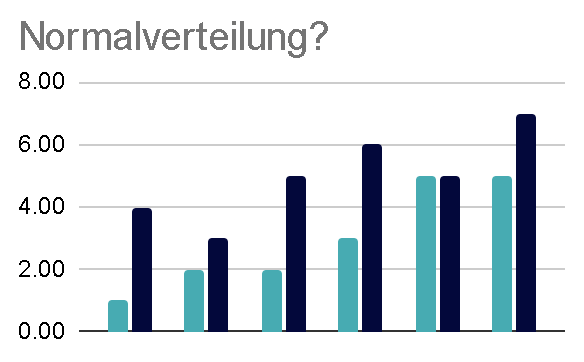
Normal distribution: Both variables should be approximately normally distributed. If that is not the case, Spearman’s rank correlation may be a suitable alternative. Here, too, a visual analysis of the histograms is useful. If you want to know for sure, there are of course also statistical tests for this, such as the Shapiro–Wilk test.
No outliers: Extreme values can strongly influence the correlation coefficient.
Critical values of the correlation
To estimate the statistical significance of the hypothesis test, we can use a table of critical values for comparison. The sample size n is particularly important, as it determines which row we need to look at in the table. If we then find an r that is at least as large as the critical value in the corresponding row (note that these are absolute values!), we can assume statistical significance (p < 0.05).
| Degrees of freedom: n – 2 | (absolute) Critical values |
|---|---|
| 1 | 0.997 |
| 2 | 0.950 |
| 3 | 0.878 |
| 4 | 0.811 |
| 5 | 0.754 |
| 6 | 0.707 |
| 7 | 0.666 |
| 8 | 0.632 |
| 9 | 0.602 |
| 10 | 0.576 |
| 11 | 0.555 |
| 12 | 0.532 |
| 13 | 0.514 |
| 14 | 0.497 |
| 15 | 0.482 |
| 16 | 0.468 |
| 17 | 0.456 |
| 18 | 0.444 |
| 19 | 0.433 |
| 20 | 0.423 |
| 21 | 0.413 |
| 22 | 0.404 |
| 23 | 0.396 |
| 24 | 0.388 |
| 25 | 0.381 |
| 26 | 0.374 |
| 27 | 0.367 |
| 28 | 0.361 |
| 29 | 0.355 |
| 30 | 0.349 |
| 40 | 0.304 |
| 50 | 0.273 |
| 60 | 0.250 |
| 70 | 0.232 |
| 80 | 0.217 |
| 90 | 0.205 |
| 100 | 0.195 |
Example: Examining a Relationship
Imagine you want to examine the relationship between study time (in hours) and test scores. The following values are available for six students:
| Student | Study time (hours) X | Test score Y |
|---|---|---|
| A | 2 | 50 |
| B | 3 | 60 |
| C | 5 | 80 |
| D | 4 | 70 |
| E | 6 | 90 |
| F | 1 | 40 |
Here you can find the calculation in Google Sheets:
Limitations and Caution When Interpreting Results
- Correlation is not causation: Even if two variables are correlated, this does not mean that one causes the other.
- Linear relationships only: The Pearson coefficient measures exclusively linear relationships. Nonlinear relationships are not captured.
- Influence of outliers: Individual extreme values can significantly distort the value of r.
Applications of the Pearson Coefficient
The Pearson correlation coefficient is used in many fields, including (for example):
- Psychology: The relationship between IQ and academic performance.
- Medicine: The relationship between the dose of a medication and its effect.
- Economics: The relationship between marketing expenditure and revenue.
Conclusion
The Pearson correlation coefficient is a valuable tool for analysing linear relationships between two variables. However, using it requires care, particularly with regard to its assumptions and the interpretation of the results. With suitable visualisations and complementary measures, it can nevertheless provide deeper insights into the data.