
In this exercise, you will learn how to use one-way ANOVA in R to test whether average job satisfaction differs significantly between three departments. You will prepare the data manually, check the assumptions of ANOVA, and conduct the analysis, including a Tukey post hoc test. This practical exercise will help you apply statistical methods to real-world questions in a targeted way.
Task: One-Way ANOVA in R
A company wants to investigate whether average job satisfaction differs between three departments.
You are given the following data for this purpose.
| Department | Satisfaction scores |
|---|---|
| A | 4.2, 4.5, 4.7, 4.3, 4.6 |
| B | 3.8, 3.9, 4.0, 3.7, 3.9 |
| C | 4.1, 4.0, 4.2, 4.1, 4.3 |
Task:
- Manually convert the data into a format that you can work with effectively
- Explain why a one-way ANOVA is the appropriate approach here.
- Check the assumptions for conducting a one-way ANOVA.
- Conduct the one-way ANOVA and interpret the result.
- If significant differences are found, conduct a Tukey post hoc test and interpret the results.
Solution to the Exercise: One-Way ANOVA in R
The Solution in the Video
The Complete R Script
# Load data
# Department | Satisfaction

df <- data.frame(Abteilung = as.factor(c(rep("A", 5), rep("B", 5), rep("C", 5))),
                 Zufriedenheit = c(4.2, 4.5, 4.7, 4.3, 4.6, 3.8, 3.9, 4.0, 3.7, 3.9, 4.1, 4.0, 4.2, 4.1, 4.3))
head(df)
str(df)

# ANOVA
ergebnis <- aov(formula = Zufriedenheit ~ Abteilung , data = df)
summary(ergebnis)

# Test assumptions

## Homogeneity of variance
library(car)
leveneTest(df$Zufriedenheit, df$Abteilung)

## Normal distribution
shapiro.test(df[df$Abteilung == "A", "Zufriedenheit"])
shapiro.test(df[df$Abteilung == "B", "Zufriedenheit"])
shapiro.test(df[df$Abteilung == "C", "Zufriedenheit"])

# Visual inspection
hist(df[df$Abteilung == "A", "Zufriedenheit"])
hist(df[df$Abteilung == "B", "Zufriedenheit"])
hist(df[df$Abteilung == "C", "Zufriedenheit"])

# Post hoc tests
TukeyHSD(ergebnis)

# Nonparametric alternative: KW
kruskal.test(formula = Zufriedenheit ~ Abteilung , data = df)

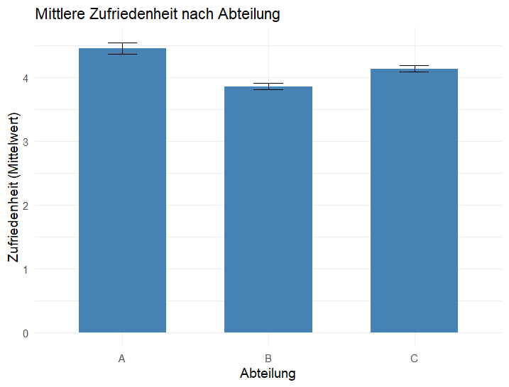
# Graphically
library(ggplot2)
ggplot(df, aes(x = Abteilung, y = Zufriedenheit)) +
  stat_summary(                # summarizes
    fun = mean,                # here: mean
    geom = "bar",              # Draw bars
    fill = "steelblue",
    width = 0.6
  ) +
  stat_summary(
    fun.data = mean_se,        # Mean ± error bars (SE)
    geom = "errorbar",
    width = 0.2
  ) +
  labs(
    title = "Mean satisfaction by department",
    x = "Department",
    y = "Satisfaction (mean)"
  ) +
  theme_minimal(base_size = 14)
Chart
Alles klar?
Ich hoffe, der Beitrag war für dich soweit verständlich. Wenn du weitere Fragen hast, nutze bitte hier die Möglichkeit, eine Frage an mich zu stellen!